Centric India’s Ruchika Gupta goes more in-depth into her journey to becoming a member of a competitive machine learning (ML) team.
As I described in part 1 of my story, in only a matter of months, my colleagues and I at Centric India became machine learning (ML) certified, created a team of people with diverse data and analytics skillsets, and began preparing to participate as Centric India’s first-ever ML team for our company-wide, 2020 Expedition: Data event.
My teammates — Seema Bansal, Mehani Hakim, Shiv Mohan and Akshat Kulshrestha — and I had bonded and learned a lot about ML quickly, but to move ahead, we needed to create a vision around our project, test various solutions, and develop our ML strategies.
Planning and Execution
Our goal was to help Centric’s client, a digital marketing firm, identify the characteristics of consultants who were at risk of leaving the firm. We wanted to develop ML and data-science-based retention programs for those consultants. Building on this basic idea, we created guidelines for ourselves to:
- Create our data pipeline
- Find our necessary data
- Analyze and validate our data
- Enrich and transform our data
- Operationalize our data pipeline
- Develop and optimize our ML model using Auto ML.
Let us walk through each phase of our project.
Creating Our Data Pipeline
To create the data pipeline, we used Azure Data Factory (ADF). ADF can integrate various tables used in the query to make a dataset. Our motive was to use this dataset in the pipeline, which would then use with Copy Activity to synchronize the data in a comma-separated values (CSV) file. Once we ran the pipeline, we could retrieve the data from Storage Explorer.
Finding and Preparing Our Data
Data preparation is key for any successful ML solution because whatever dataset we create must support the end decision.
The question for our team was, “What exactly do we want to derive from the data? What is our desired result?” Using Seema’s experience, we had already started analyzing the data by going through the tables and columns to sample it. We wanted to find the crucial factors that could affect consultants’ decision to stay or leave the organization, such as their job start/stop dates, job titles, salary structures, commute distances, commissions and office culture.
The first challenge we faced was a failure of our data to cross-join among the tables. So, we reached out to business experts for more clarification of the data.
After juggling many tables and columns, we made one master query by making common table expression (CTE) tables and storing procedures to collect the data in one dataset. Now we needed to assess the data’s condition, including trends, outliers and exceptions, as well as incorrect, inconsistent, missing or skewed information.
We conducted an iterative process of data analysis and data cleansing. We then completed a round of testing by dividing the query into bits and pieces to ensure that whatever data we obtained from the master query was correct. Finally, we were ready to export the aggregated data into a CSV file.
A major step at this point was formatting the data. Because we were aggregating data from various sources, we risked experiencing anomalies or abbreviations. We formatted the data to ensure that the entire data set used the same input formatting protocols. Finally, we created a query that included various aggregated functions and fetched the required data for customer retention.
With some initial problems solved and our data gathered and cleaned, we were ready to analyze it more deeply and ensure validity.
Analyzing and Validating Our Data
We used exploratory data analysis (EDA) at this stage to better sort and understand our data. EDA helped us sort data into bands and provided important visualization tools.
EDA is an approach to analyzing data sets to summarize their main characteristics, often using visual methods. You can use a statistical model or not, but EDA helps reveal what the data can tell us beyond the formal modeling or hypothesis-testing task.
In our project, the main EDA task was to:
- Analyze the entire data set and identify the factors that could lead to high attrition
- Make sure that the Python form visuals depicted the same relationships as the various relationships between attrition ratio and other features.
For example, below is our data visualization for the Service Duration and Age bands:
- Analysis on Service Duration Band: Here is how we analyzed attrition according to employees’ duration of service with the organization.
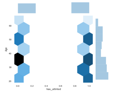
- Analysis on Age Band: Here, we visualized attrition per the age band, “0” means “has not gained attrition,” and ‘1’ represents “has gained attrition.” Darker shades indicate a larger number, and lighter shades indicate a lower number. For example, we can see that more people have attrition in the 20-30 age group and that people in the 30-40 age group are least likely to attrite. The number of people who have attrition is roughly the same for people aged 40 and above.
Similarly, we created EDAs with the various features, which allowed us to filter the data further and discover other key features that lead to higher attrition. We were then ready to make sure the algorithm would understand our data.
Enriching and Transforming our Data
We used a process called feature engineering to make our outputs understandable to the algorithm. It resulted in improved model accuracy for data that the algorithm has not seen yet. We followed various techniques for our feature engineering efforts:
- Imputation allowed us to address the problem of values missing from the data set. We took two imputation steps:
-
- We dropped rows or columns missing 70 percent or more of their data.
- For rows or columns missing less than 70 percent of their data, we imputed them with the column’s median value. Medians are more solid because the averages of the columns are sensitive to outlier values.
- Binning allowed us to place data into categories, or “bins,” to make models more robust and prevent overfitting (we’ll discuss this in our next section). However, every time you bin data, you lose information, and the data becomes more regularized. Some bins in our project were Age Bins, Salary Bins, Service Duration bins, Location Bins, and so on. We also used these bins for our EDA visualization, as you can see above. We created the visualization using Age bands, which the bin created using the ages of the customers.
- Correlation Feature Selection allowed us to evaluate subsets of features based on the following hypothesis: “Good feature subsets contain features highly correlated with the target, yet uncorrelated to each other.” In our project, we used two procedures to select features based on correlation:
-
- Brute Force Approach finds correlated features without any further insight. Using this method, we could drop highly correlated features while keeping a threshold value. We selected a value of 0.85, meaning that we dropped features that are 85 percent related to each to avoid biasing our model.
- Groups of Correlated Features identifies groups with three or more correlated features. We then select from each group which feature we want to keep and which we don’t.
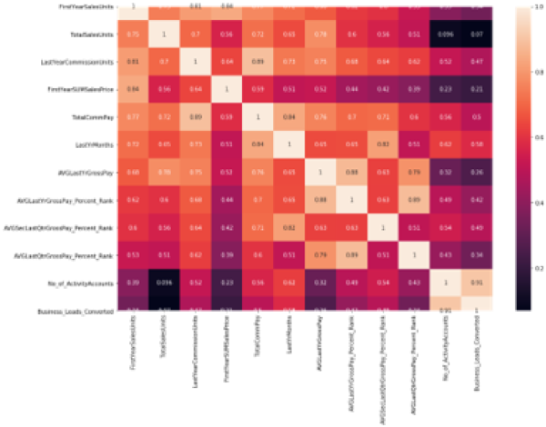
The heat map below visualizes the correlation among our features listed at the left and bottom sides of the image. Lighter colors indicate highly correlated features, and darker colors indicate lightly correlated features.
- Scaling allowed us to normalize the range of the data’s independent features.
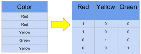
- One Hot Encoding (OHE) allowed us to convert categorical data, which is challenging for algorithms to understand, into a numerical format. It spreads the values in a column and assigns them the values 0 or 1. These binary values express the relationship between grouped and encoded columns. Below is a simple example of OHE:
After performing the Feature Engineering operations, we were ready to apply the model to our data after splitting that into subsets.
Operationalizing Our Data Pipeline
At this stage, data scientists typically split data into subsets, training data and testing data. The goal is to fit the training data to make predictions on the test data.
When fitting our model, we faced the challenge of overfitting or underfitting. Overfitting occurs when you train a model “too well.” It is perfectly accurate on the training data, but it may not be accurate on untrained or new data. That means we can’t generalize the results or make any inferences from other data. In contrast, underfitting occurs when the model does not fit the training data. Therefore, it misses the trends in the data and cannot be generalized to added information.
Finally, we were ready to apply the model to our trained data and predict the result for the Expedition: Data problem.
Developing and Optimizing Our ML Model
With our understanding of the various approaches to classification problems — such as logistic regression, support vector machine, k-fold cross-validation, naive Bayes classifier, random forest classifier and decision trees — we were ready to compare our results.
We decided to try logistic regression followed by k-fold cross-validation and then random forest classifier.
Let us talk briefly about these three approaches:
- Logistic Regression is a predictive analysis technique used in machine learning for binary classification problems. It is a special case of linear regression that analyzes a dataset with a dependent variable and one or more independent variables to predict the outcome in a binary variable. Having our output variable in binary format enabled us to apply this method.
- K-Fold Cross-Validation is a re-sampling procedure used to evaluate ML models using a limited data sample. The procedure has a single parameter called k, which refers to the number of groups into which we will split a given data sample. We shuffle the dataset randomly, and when a specific value for k is chosen, we split the dataset into that value. This is primarily used in applied ML to estimate the skill of a model on unseen data. It is popular because it is simple to understand and results in a less biased estimate of the model than other methods, such as a simple train/test split. We always apply cross-validation on our complete dataset because it removes the need to split our data into a test and train dataset.
- Random Forest Classifier includes many decision trees. A decision tree is a decision-making model humans can easily understand. We ask a sequence of questions using the information we have until we arrive at a decision. Random forest classifier creates a set of decision trees from randomly selected subsets of the training set. It then aggregates the decisions from different decision trees to determine the final class of the test object.
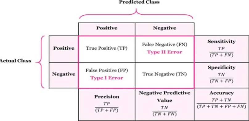
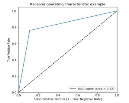
With the help of regression, cross-validation and random-forest classification, we created the confusion matrix, a receiver operating characteristic (ROC) curve, its score and its accuracy. The confusion matrix allows us to visualize an algorithm’s performance and reveals the number of correct predictions for each class:
Below are the results and ROC curve created from our prediction related to our use case:
Developing and Optimizing our ML Model with Azure Auto ML
However, we ran into another challenge — Azure Auto ML. From the beginning of our project, we were certain we would explore Azure ML Studio’s potential design, development and deployment options. We knew it would give us the enterprise-level solution we needed. Akshat used his past knowledge to explore the options, and we got our first prototype running in a day. But we soon realized Azure ML Studio’s limitation — we had no database connectors to pull information from. Our only option was to pull source data from a CSV file.
As a result, we switched gears and started exploring Azure Auto ML. As expected, it was a great tool. We ran our data extract against multiple machine learning algorithms ranging from logistic regression to a random forest classifier in a couple of minutes. It helped us identify suitable ML algorithms for our requirements.
Finally, we zeroed in on a random forest. Still, Azure Auto ML was not our silver bullet because we could not control our hyper-parameters or see what level of feature correlations Auto ML was ignoring. Lack of documentation for this new offering was another challenge.
So, we focused on everything we would do with Azure Auto ML:
- Quickly train a model and observe its predictions
- Observe the feature engineering to understand if the SQL query we were working on contained relevant features
- Quickly create an Azure Kubernetes Service (AKS) to deploy a representational state transfer (REST) endpoint
- Create engaging graphs for the confusion matrix, ROC and precision-recall curve
- Get a quick snapshot of all our past experiments using the Auto ML dashboard.
Unfortunately, we could not:
- Control the hyper-parameters
- Run common table expression SQL queries using SQL connectors
- Split our test and train dataset to another valid dataset and get predictions against it
- Find the documentation to support our tool exploration.
Azure Designer
We discovered we could further improve our Azure Auto ML results if we had better insight into the inner workings of the ML pipeline. So, our emphasis shifted toward Azure Designer (AD), which allowed us to create our model as a set of pipelines.
We found AD interesting because we could test our pipeline in a step-by-step manner while controlling run-time parameters, such as split ratio and custom missing value imputation. It also allowed us to control the normalization process and feature-selection algorithm, and it let us deploy a model either as a batch pipeline or a REST/web API endpoint.
We successfully deployed our model to an AKS, which is a managed container orchestration service based on the open-source Kubernetes system, available on the Microsoft Azure public cloud. Using AKS, we deployed and scaled container-based applications across a cluster of container hosts. This process also helped us generate a REST endpoint. Since our project was exploratory, we started working on a solution to infer our online endpoint.
Then, we decided to explore the Postman REST Client’s “Collection Runner” functionality to pass through a CSV file containing a validation dataset. Bingo! We started getting predictions from our model. Imagine the bright smiles on our faces.
Finally, we were ready to use the Azure Data Factory pipeline and its Azure SQL connector option to iteratively process all employees in our data set through our ML pipeline, storing the results in a CSV or some other suitable format.
The End Results of our Machine Learning Journey
The day of the competition arrived, and it was time to highlight our challenging work. After a few rehearsals and some last-moment touchups, our final presentation was ready.
Shiv drove the complete presentation while Mehani covered the EDA part, and Akshat conveyed the Auto ML segment. We had a half-hour slot for the presentation, and we allocated time accordingly to each part, reserving the last five minutes for Q&A.
This might sound easy, but the degree of competition was overwhelming. We knew it would not be a cakewalk, and yes, we were a little nervous.
Fortunately, the presentation went very smoothly. Everyone was impressed and excited to see this kind of effort from a newcomer team. We won second place in the competition and gathered a lot of appreciation for our efforts. For all of us, successfully competing in Expedition: Data was a huge sense of achievement.
We were all happy and ready to celebrate over a team lunch.
Conclusion
As you can see, learning ML was a lot of work and required a team effort. While many great ML classes are available online, the only way to truly learn ML is through trial and error. The Centric India team appreciates our company’s support of our work and the opportunity to compete. We are already using what we have learned to benefit clients as we introduce them to the exciting world of ML.


