
How powerful is Power BI? Let’s build a fantasy baseball team and find out!
When I want to learn a new software tool, I will often use the tool to develop an application. Sometimes the application is for work, and sometimes it is for personal use.
This process is a good way to learn the tool while working on something I am familiar with and have a personal interest in. After all is said and done, the goals are to learn a new tool and to have an application that I can actually use.
Recently, I embarked on such a learning experience while trying to learn Microsoft’s Power BI. I am an avid baseball fan and participate annually in a fantasy baseball league. One of my first thoughts was to use the tool to analyze baseball data. I conducted a similar exercise several years back when I was learning Tableau. Not only did my personal interest help me learn Tableau and eventually get certified, it helped me better compete in my fantasy baseball league.
Drafting My Fantasy Baseball Team with Power BI Quick Insights
This time, I wanted to develop a tool that would improve my fantasy baseball draft picks. Rather than using my gut instinct to make picks, I wanted to make my picks based on what my team needed, such as runs, home runs, and stolen bases, at any given point in the draft.
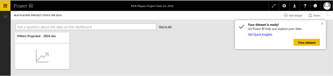
First, I exported projected stats for hitters and pitchers from www.fangraphs.com to an Excel spreadsheet and then imported this data into Power BI.
After Power BI connected the new data set to the dashboard, it automatically generated several visualizations (e.g. graphs, charts or images) showing insights found in the data. I simply needed to click on the “Get Quick Insights” link provided in the pop-up window to see them.
Power BI Quick Insights are available via a pop-up window link as soon as data is connected.
Being a baseball fan, many of the insights were things I would expect. The graph below shows the correlation between at bats (AB) and hits (H). No real surprise there but still good to confirm.
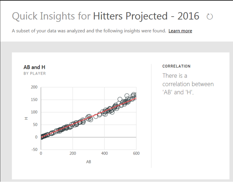
Power BI “Quick Insights” graph showing a correlation between at-bats and hits.
The Quick Insights feature is a nice element of Power BI that allowed me to immediately discover more about my data, sparking questions I could explore further.
- Interested in seeing more examples of Power BI Quick Insights? See them all here.
Making My Team Better with Power BI Visualizations
After I reviewed the Quick Insights for my baseball data, new questions came to mind. With Power BI I can simply ask and Power BI will answer by building visualizations. It took a little practice to learn how to ask the questions appropriately, but as soon as I got the hang of it I could build visualizations on the fly.
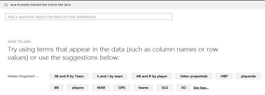
Having trouble forming your questions? Use Power BI’s interactive help feature!
Below is an example of the visualization that was built when I asked the question “Which team will have the most H?” In my data, H stands for hits. This ability to ask simple questions allowed me to easily get started with building visualizations before knowing how to fully use the tool.
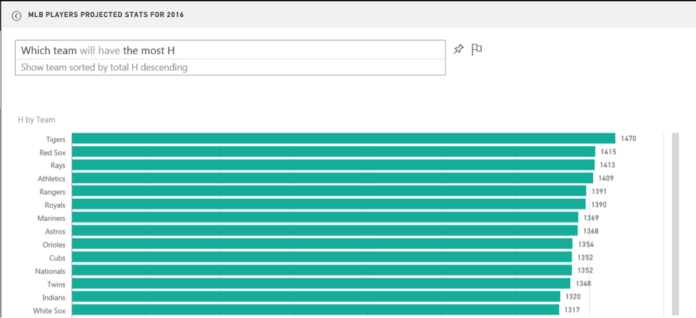
Power BI visualization showing which team will have the most hits.
As I continued exploring the data, other questions came to mind. I wanted to find out if there was a correlation between stolen bases and runs. Power BI simplified the process even further. I didn’t have to enter the full question, “Is there a correlation between stolen bases and runs?” By only typing “SB and R by Team,” Power BI generated the scatter chart below. Take that, Alex Trebek! Based on my data, there does not appear to be a direct correlation between stolen bases and runs scored. Windows 10 users can skip the typing completely by asking Cortana!
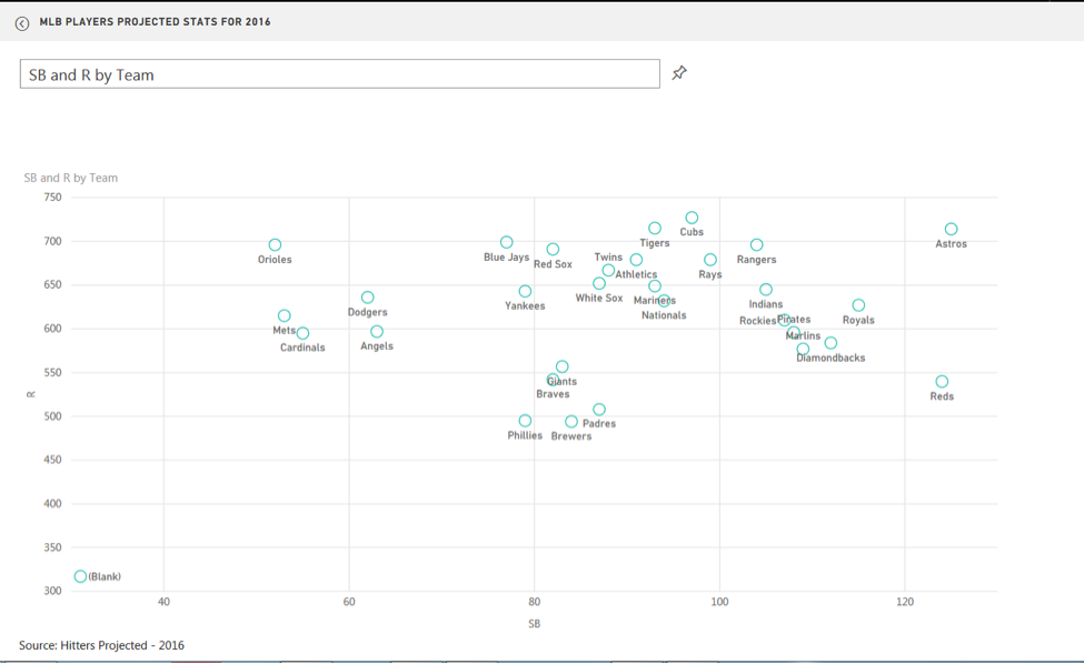
Power BI scatter chart showing the correlation between stolen bases and runs.
When I realized I wanted to keep some of the visualizations generated to help me during the draft, Power BI allowed me to pin it to a dashboard with a simple click on the pushpin next to the question bar.
While drafting my fantasy team, I spent a good deal of time getting familiar with how to build reports and dashboards in Power BI. I’m impressed with the ease of use of this tool as well as the crisp, clean user interface and visualizations.
Winning the Fantasy League with Power BI
After my fantasy draft was completed, I further analyzed my team compared to the rest of the league. I determined that I needed more power numbers (home runs and runs batted in). I searched the waiver wire and found a young rookie named Trevor Story. I picked Trevor up before the season started and what a story he has been! He became the first MLB player in history to hit a homer in his first four career games. He set another MLB record by hitting seven home runs in his team’s first six games of the season. Trevor is currently a top-ranked player in my fantasy league with 27 runs, 12 home runs, 31 runs batted in and a .272 batting average. I am currently in 2nd place in my league.
It is results like this that are the reason we analyze data, to begin with. Power BI can help you analyze your data and achieve similar results in your business and personal endeavors.
