
Follow our step-by-step approach on how to use Power Apps to make it easy to view PDFs.
I had a client approach me with a need to organize and present some PDF training materials to their employees in a format that is easily viewed from a tablet or mobile device.
They needed a lightweight app using Microsoft 365. This took a little bit of research and a customized Flow, but the result was exactly what the client wanted.
I want to thank Microsoft PowerUser Paul Culmsee for sharing his solution, which I adapted for my project. Now, let’s dive into the details.
The Request: Use Power Apps to View PDFs
Our client wanted a Power App to allow users the ability to quickly locate a training PDF file according to the questions answered within the app. The criteria:
- Files had to be in PDF format.
- Files had to be stored in SharePoint.
- Users had to be able to navigate to their desired files quickly and easily.
- The application had to be mobile-friendly.
The Power Apps Solution We Came Up With
To meet expectations, I had to create a custom Flow alongside the Power App. Currently, at the time of writing this blog, the PDF viewer control within Power Apps is still in the “experimental” stage. This means that PDFs stored within a SharePoint document library are not viewable within the Power App PDF viewer control.
So I built the Power App using a SharePoint document library, one custom Flow and six screens. Later in this article, I’ll describe in greater detail the Flow design and the design of the main screen. Let’s first look at the SharePoint document library.
Readying a SharePoint Document Library
I customized the SharePoint document library by adding three columns.
- The client had organized the documents into three main training topics. I used a choice column, which I labeled “Initial Choice” for the topics.
- Then, I created two identical hyperlink columns and set them to format the URL as an image:
-
- One column I labeled “DefaulticonURL” and the other one I labeled “SelectediconURL.”
- For each PDF file, I created two images and uploaded them to an Asset document library. One image is grey, and the other image is blue.
- I copied the URL from each image and pasted it into the hyperlink columns. So, the grey image’s URL went into the “DefaulticonURL,” and the blue image’s URL went into the “SelectediconURL.”
Here is the result for the documents within the SharePoint library:
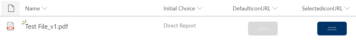
View of Documents in the new SharePoint Library.
Creating the Workflow to Tie Into Power Apps
Before diving into how to use Power Apps itself, we’ll need to create a workflow from scratch since there isn’t a template that will work for this project. I used Microsoft Power Automate (formerly known as Flow).
Before I go any further I need to point out that the key piece of information we will be using from the PDF is the “Identifier.” This is being pulled into the Power App through the SharePoint-connected database.
Now, onto building the workflow.
Creating a Flow Step 1
Create a new Flow and search for the action called Request.
We are starting with a trigger when an HTTP request is received. This means that every time Power Apps tries to load a PDF, it sends a request to a URL that is this Flow. Now we will be using the “GET” method to retrieve the identifier of the currently selected PDF in the gallery control.
Also, the HTTP POST URL field is blank until we are finished building the Flow and save it. Then this field will be populated, and we can copy the URL to use within the Power App.
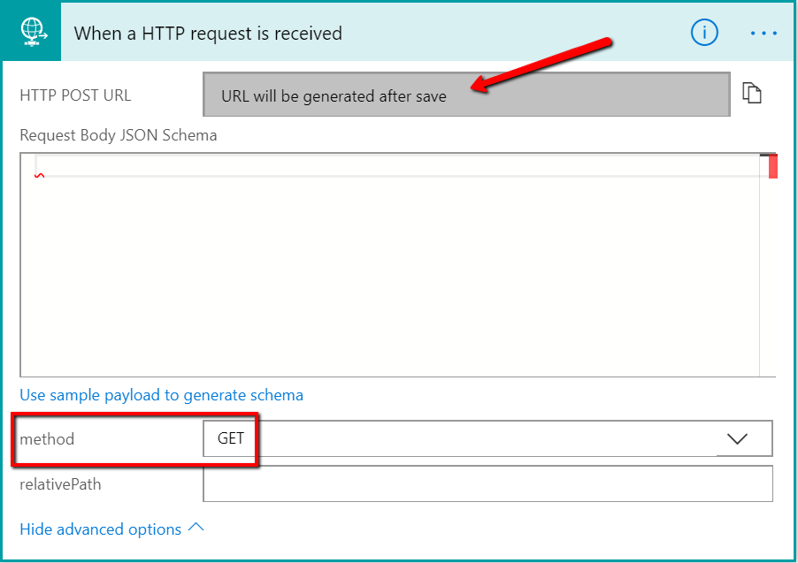
Select “URL will be generated after save” to use the GET method in Power Automate.
Creating a Flow Step 2
The next step is to capture the item Identifier from the request. We will be passing the Identifier from the file to the request.
To pull this off, we need to use a variable. Search for a variable and select Variables – Initialize variable. Name it something descriptive like pdfID, or whatever makes the most sense to you.
The type will be a String.
The Value is where we are going to dictate the part of the HTTP request we want to grab the Identifier information from.
To do this, we must write an Expression. This expression will use specific criteria to search the HTTP request for the information that we need. Without getting too technical on you, here is the expression that will be saved within the value field: trigger()[‘outputs’][‘queries’][‘itemid’].
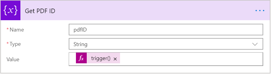
Get PDF ID in Power Automate.
In other words, we are going to pass into the body of the URL an item ID. The variable will extract it from all the material that came in with the request.
Creating a Flow Step 3
Now we can create a SharePoint action, specifically SharePoint – Get file content. Set the Site Address field to the site where you store your PDF files.
The next field, File Identifier, asks for the information that we stored within the variable from the previous step. Add the variable to the File Identifier field.
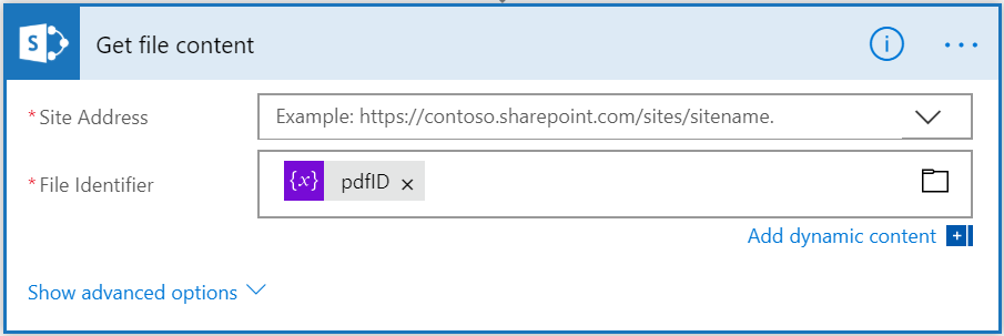
Get file content in Power Automate.
Creating a Flow Step 4
In the final step, we are now going to send this file back to Power Apps. Add another Request action, but this time, it is a Request – Response.
In the Body field, we want to add the output of the get file content from the previous step.
If you want your users to have the ability to open the PDF within a browser window, then we need to configure the Headers fields.
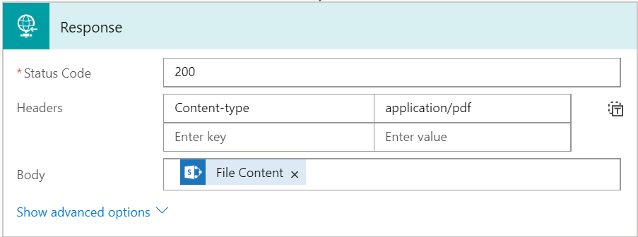
Sending the file back to Power Apps in Power Automate.
Go ahead and save the Flow in Power Automate, making sure to give it a descriptive name.
Scroll up to the first step, and you’ll see that the URL field has been populated. Click on the copy icon to the right so that we can paste this URL into the Power App.
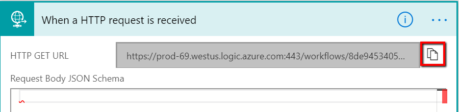
Getting the URL in Power Automate to add to the Power App.
Integrating the Flow into Power Apps
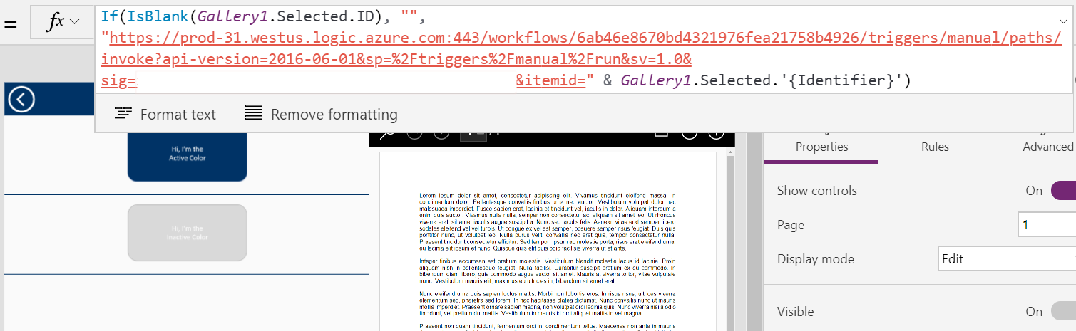
In the Power App, click on the PDF viewer control and select the document property. Paste the URL from the Flow here.
Now we need to tell the control which PDF has been selected from the gallery control.
At the end of the URL, you will need to add &itemid= This is the same parameter that we used within the expression of the variable from the Flow.
To connect this to the gallery, add & Gallery1.Selected.’{Identifier}’. The name of your gallery control will need to replace Gallery1.
If everything is working properly, you should see the selected PDF from the gallery in the PDF viewer.
Customizing Power Apps Screens
Now that you’ve created the workflow, you can customize the Power Apps screens.
Power Apps Home Screen
The home screen is very basic. To give it some personality, I added an image control and a label in the top left corner that’s connected to the “Office365Users” database. This allows the app to pull in the user’s account picture and name.

View of the new home screen in Power Apps.
Power Apps Screen 2
This screen is minimal, containing a couple of text controls and one button to explain the functionality of the app to the user.
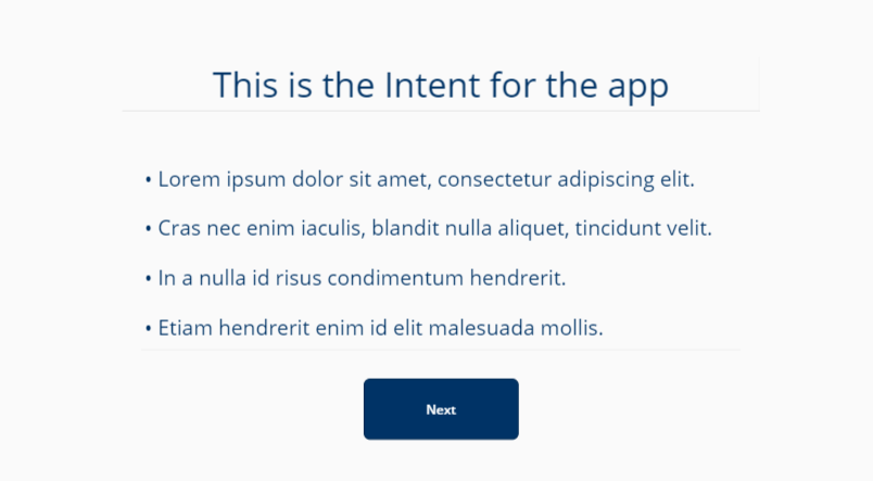
Image of Screen Two in Power Apps.
Power Apps Screen 3
Screen three is a simple design consisting of one text control and three buttons.
However, it presents the user with three quite different paths to take. Each path ends with a distinctly different group of PDF files.
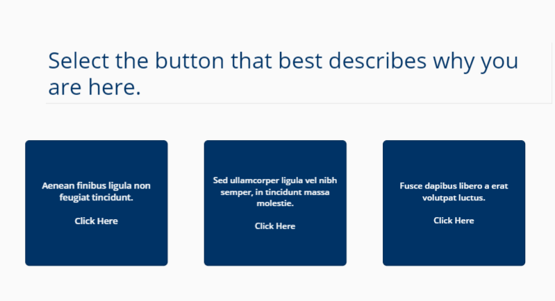
Options presented on Screen 3 in Power Apps.
Power Apps Screen 4
This is where the magic happens. It’s also where the Flow we created above comes in. There are two controls on this page: gallery and PDF viewer. The gallery control’s “Items” property is configured to filter on the SharePoint column “Initial Choice.” You must adjust the filter if you create copies of this page, as I did for Screens 5 and 6.
Below is what the default page looks like when a user navigates to it.
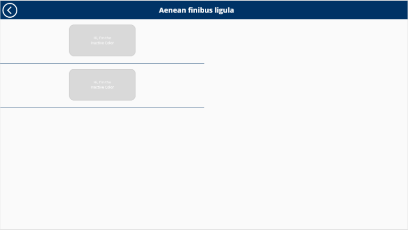
The Default page on screen four.
The images on the left, in the gallery control, are intended to present the user with either a question or a training topic. This is meant to convey the content of the PDF to the user so that they do not have to open each PDF and read through it.
I chose a light grey color to depict the files that are not active. The PDF viewer control appears inactive as well. Whenever a user navigates to this page, they won’t see a PDF selected to view, and the PDF viewer will remain hidden.
After selecting an image from the gallery control, the image will turn blue, showing that it is active. The image selection will trigger the Flow and return the desired PDF.
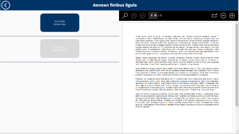
Viewing a PDF in Power Apps
The PDF viewer control toolbar is now visible. Here you can zoom in and out, navigate to other pages, and open the file in a new browser tab. Opening a new browser tab will allow the user to read the file more easily, plus provide native support to print the file.
Now that you know how to use Power Apps to view a PDF document, you can learn more advanced steps related to the design of the application.
Improving the Power App’s User Experience
After seeing the current functionality of the Power App, the client had a few requests:
- Can the user see Screen 4 without selecting files within the gallery?
- Is it possible to hide the PDF viewer whenever someone visits the screen?
- How do we let the user see that the app was working behind the scenes so the user understands to wait for the app to load the PDF? There are times when the Flow can take a couple of seconds to work and pull back the PDF file into the viewer control.
Here’s how we responded to those requests:
How to Use Power App’s PDF Viewer Variables
To solve the last request, I used a .gif image of a loading icon that rotates in a circle. Everyone should recognize that a program is loading when they see this icon.
To have the loading .gif image appear when the Flow is running and have the grey and blue images within the gallery control change when the user clicks on it to simulate a “default” experience when they navigate to the Screen, I had to create three variables. These are: PDFStateChangeCount, SelectedPDF and DefaultSel.
The Loading Image
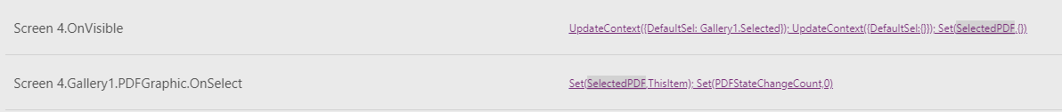
The PDFStateChangeCount variable is used to determine when to show the loading .gif image. The variable holds a number. I set it to zero on the screen OnVisible property, and the gallery image appears as “OnSelect.”
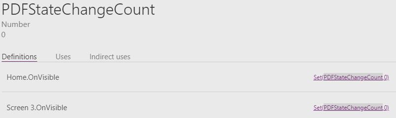
Using Power Apps’ PDFStateChangeCount variable to determine when to show the .gif.
To the PDF Viewer OnStateChange property, I added one count each time there are changes.
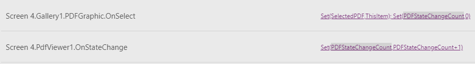
Using the OnStateChange property in Power Apps.
On the Visible property of the loading image, I have this conditional statement: If(PDFStateChangeCount>=2 || IsBlank(Gallery1.Selected.ID),false,true).
When the number is less than two, then the loading .gif is hidden. When the number equals two or is greater and passes the “IsBlank” condition, then the loading .gif is visible.
When the screen loads, the variable has a count of one. When a selection is made within the gallery, then the count increases by one, for a total of two.
At this time, the loading .gif is visible while the Flow is running. Once the Flow pulls back the PDF file into the viewer control, the loading .gif is hidden again, because it no longer passes the IsBlank condition.
Configuring Default and Active Images
The SelectedPDF variable and the DefaultSel variable are records used to show the blue and grey-colored images. The SelectedPDF is a global variable and DefaultSel is a local variable.
Here is a portion of the data that the records collect. You can see that the two image SharePoint columns are pulled into the record.
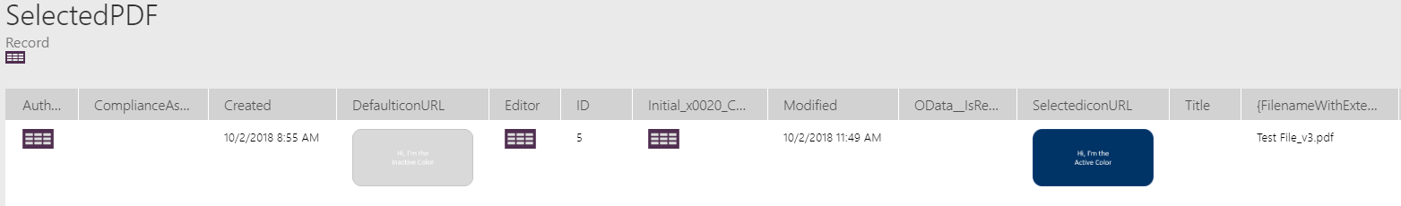
A portion of the data the SelectedPDF variable and the DefaultSel variable collect.
When the screen becomes visible, I am clearing out the SelectedPDF variable and updating the DefaultSel variable information.
The DefaultSel variable data is populated from the default property of the gallery control.
How the DefaultSel variable is populated.
The OnSelect property for the image, within the gallery control, is where I am collecting the data for the selected document.
Below you can see that I have added a conditional statement to the image property.
The conditional statement added to the image property: if(SelectedPDF.’{Identifier}’=ThisItem.’{Identifier}’, SelectediconURL,DefaulticonURL)
This statement compares the Identifier, within the SelectedPDF variable to the identifier the user selects.
If these are the same, then it will show the blue image from the SelectediconURL SharePoint column. Otherwise, it will show the DefaulticonURL SharePoint column, which is the grey-colored image.
That is how we can create a default experience for the gallery control when a user visits the screen and how to use Power Apps to change the image when one is selected.
Finishing Touches
Let’s wrap this up by applying some polish to the PDF viewer control. We will finish creating the default experience for the user.
Hiding the PDF viewer was accomplished by:
- Prefacing the Flow URL with
If(IsBlank(Gallery1.Selected.ID), “”,which is located on the PDF viewer document property. - Adding
“If(IsBlank(Gallery1.Selected.ID),false,true)”to the visible property of the PDF viewer control.
When the user navigates to Screen 4, the gallery should not have anything selected, and the PDF viewer will be hidden. Once you have this screen set up and working properly, you can use it as a template to easily create more screens like this one. Remember to update the filter that is used on the gallery control’s items property.
Final Thoughts
This sleekly designed Power App brings together Microsoft 365 products to create a solution for companies who would like to present their PDF documents to employees in a unique, mobile-friendly format. Now, you can customize the app to make the experience more professional.
Thank you for following along with me as I laid out how to build this Power App. There are many different use case scenarios that this Power App could be adapted to solve. I hope that you have been inspired to create your own.
In our webinar, we share how Power Platform can help your entire business solve problems.
