Blue or White Dress? How to Avoid an Epic Debate Like #thedress in Business Intelligence Reporting, Visualization and Dashboard Projects
As a dashboard developer working with tools such as Tableau, a good deal of time is spent selecting the right visualization that best represents answers to business questions at hand. However, there is another component equally deserving of our attention – color.
If you’ve followed the news or social media lately, you have no doubt stumbled across the debate about the color of the dress below. #thedress debate brings to mind lengthy discussions I’ve had about what colors we should use in visualizations on a dashboard. In this post I want to share some strategies that will allow you to create useful dashboards while avoiding debates about what colors people think they are seeing.
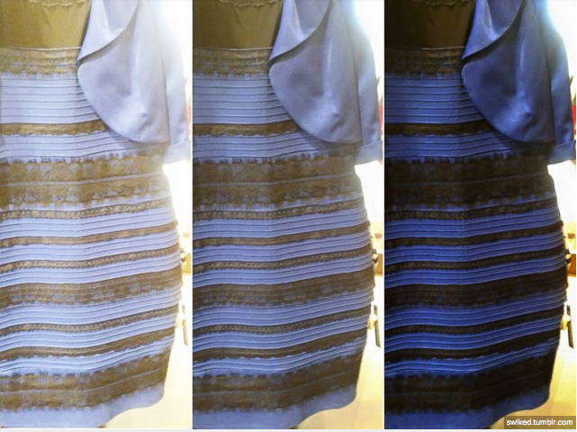
https://swiked.tumblr.com/
Create a color palette with the company branding in mind
Every company is striving for brand awareness. They want a logo and color scheme that their clients or customers remember and recognize. These colors become comfortable to those working for a particular company. Therefore, when creating the dashboard color palette, it is a good idea to remain consistent with the company branding.
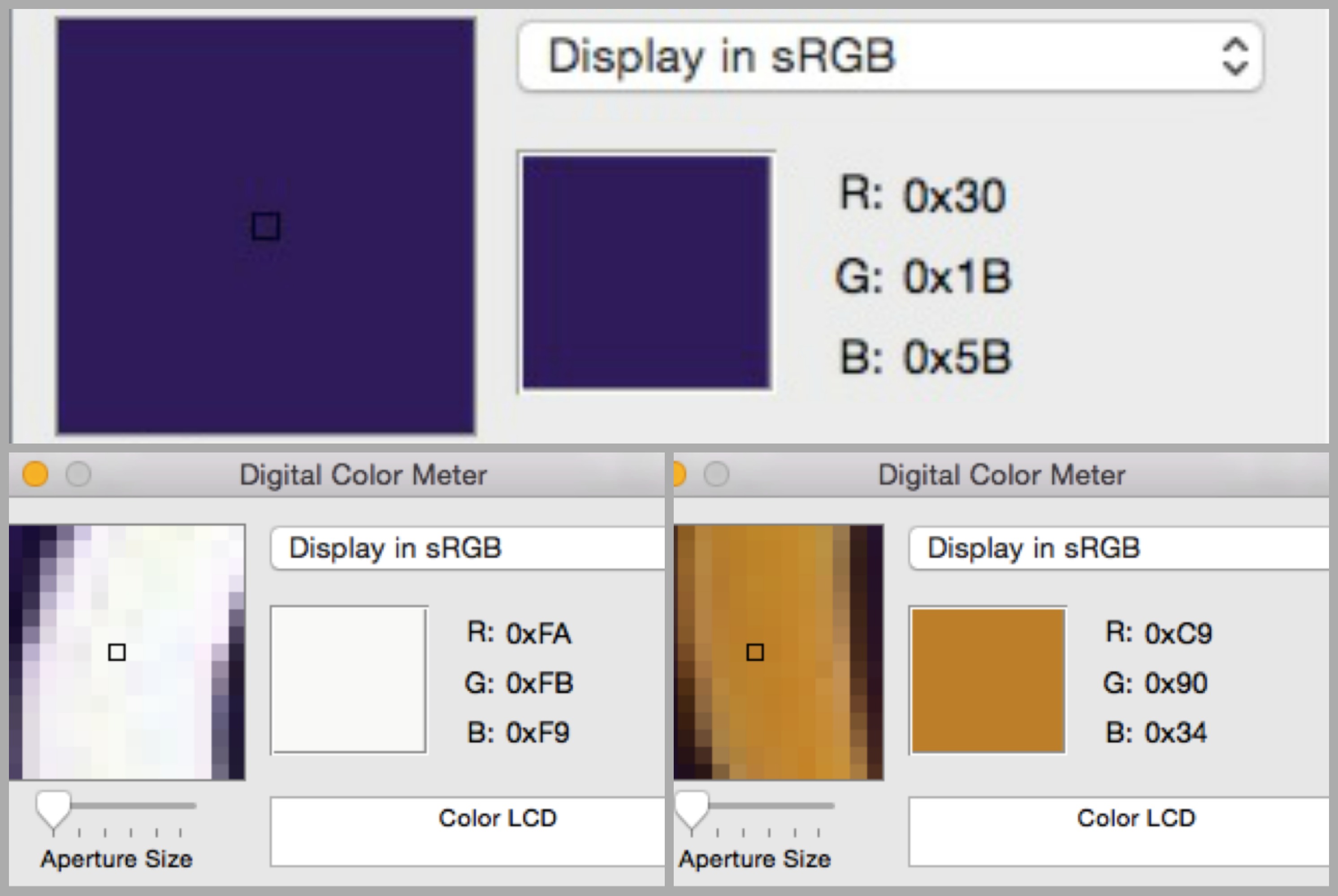
Below is a Centric Consulting logo. As can been seen, the main colors for Centric are purple, white and gold. Using an advanced tool such as Photoshop will provide the exact color parameters, as shown below.

When building a dashboard color palette, it is best to use between six and ten colors. In addition to the company branding colors, red, green, and blue are excellent choices because they are easily distinguishable from one another by the majority of people.
Consider those who may be color blind
At the height of the blue or white dress debate, I wondered how many people in this world actually are colorblind. Come to find out, about 10 percent of the population is in fact color blind. For those who are color blind, two of the hardest colors to differentiate are red and green. These two colors are used often to communicate KPIs, especially within the finance industry.
Even though red and green are difficult to differentiate for those who are color blind, there are ways to use these colors without misleading the audience. Here are some basic approaches to consider:
A. Set the colors in opposite directions on a bar chart
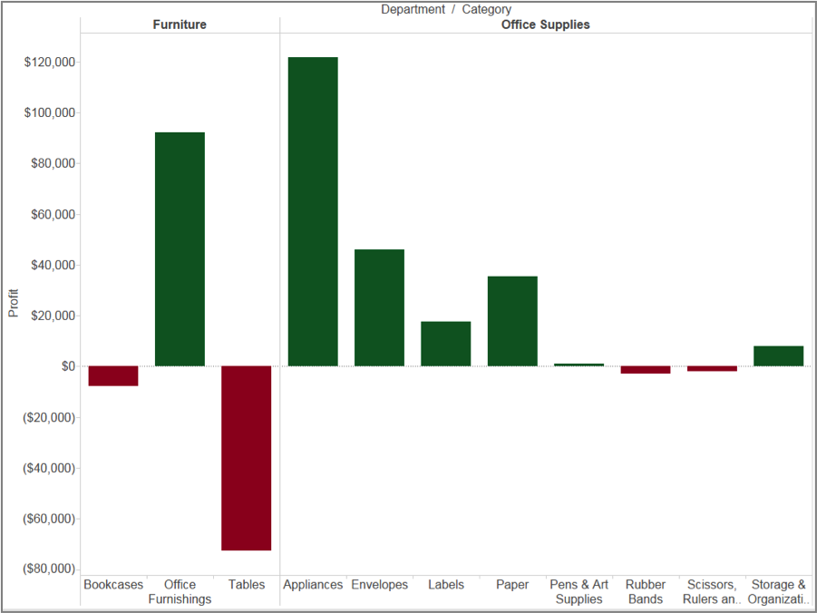
In the example below, green indicates profit and red indicates loss. Using green and red in opposite zones of a bar chart allows people to visualize the difference even if they struggle to distinguish the green from the red.
B. Annotation as a Powerful Tool
By including annotation, the audience can understand the message of the visualization regardless of the colors used.
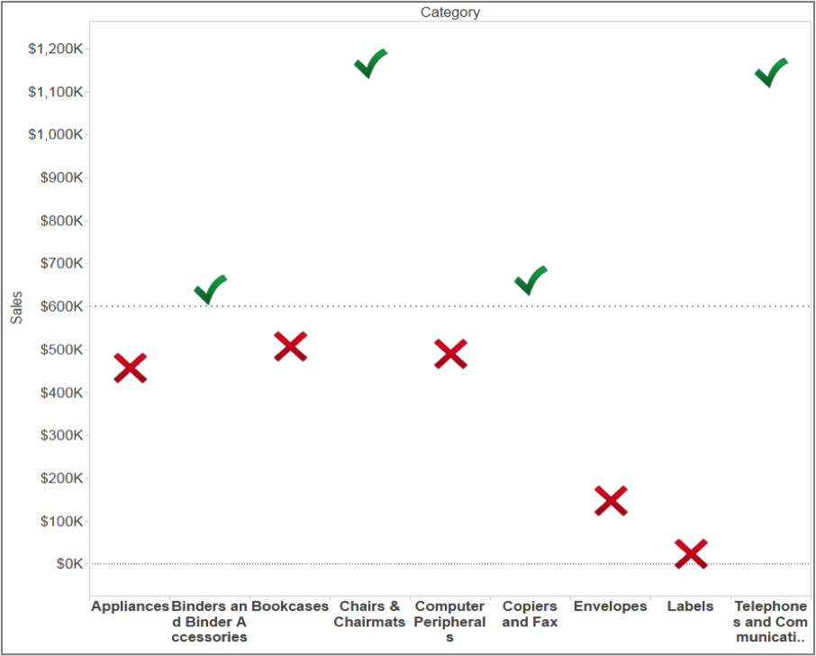
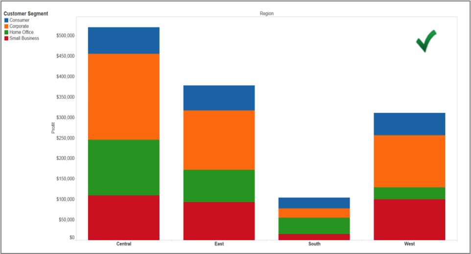
C. Consider using different shapes when communicating KPIs
In the case below, the check mark is green and the cross is red. Audiences can easily distinguish these two symbols without any further explanation.
Avoid pitfalls
In addition to the recommendations above, there are also some pitfalls you want to avoid:
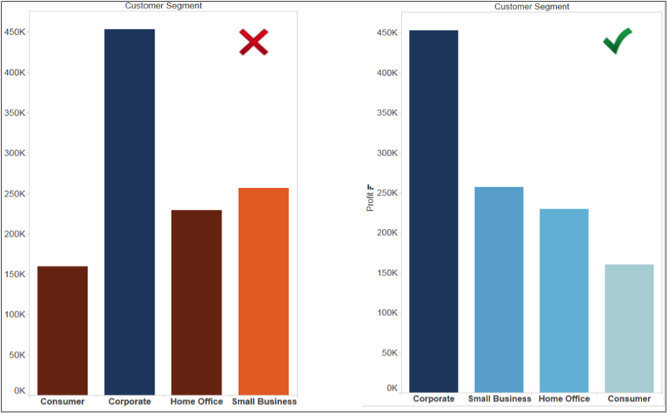
Pitfall 1: Using different colors within the same logical group
Less is more. When you show visualizations that belong to the same logic group, using the same color group will be more efficient. Another good practice is to sort your data. This helps the audience easily follow the message you want to send. In the example below, I want to answer the question, ‘Which customer segment generates the most profit?’ Therefore, I sort the segment by profit in a descending order.
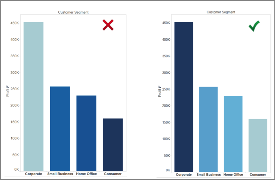
Pitfall 2: Using a lighter color to highlight the most important message
Our minds usually notice the darkest color first. Therefore, we should use the darkest color when we want to highlight a specific part of the visualization. In the example below, I show a visualization that answers the question, ‘Which customer segment generates the most profit?’ Since the corporate segment ultimately does this, I assigned it the darkest color.
On the contrary, if I want the audience to focus on the customer segment which brings in the least profit, I would assign the darkest color in the lowest customer segment.
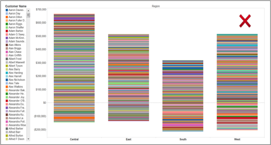
Pitfall 3: Using too many colors in a visualization
Using too many colors can be confusing. A good rule of thumb is that there should be less than five colors in a visualization. Presenting too many individual colors will overwhelm the visualization.
A more practical approach is to group the colors by customer segment. For instance, I can easily tell which corporate segment generates the most profit based on the second graph below.
Pitfall 4: You told us to assign the color to fit the branding strategy, so I use the same colors for everything!
Yes, I told you to keep the company branding strategy in mind. However, I also told you to get a color palette that includes at least six different colors. You do not want users struggling to distinguish between various shades of blue in a conference call. In fact, using colors that can easily be distinguished will reinforce the message you want to send.

By following these recommendations you can create visualization dashboards that show off great data and don’t set off an internet storm of people arguing whether your visualization is blue and black, or white and gold.
Note – Tableau Superstore Sample Data was used to build image visualizations.