Chart Smart: Convey Your Message in a Powerful Way
A simple guide for creating impactful charts
Some say, “A picture is worth a thousand words.” We live in a data-driven world where people create reports on an almost daily basis. As a result, the ability to communicate via visualization has become a critical skill.
Have you ever wondered if there were any easy “rules of thumb” to follow so your charts send a clear message? In this post, we will discuss what makes a visualization successful and how to pick the correct chart type to best convey your message. We will also talk about how to avoid pitfalls in tricky situations.
What makes a visualization great?
 An eye-catching chart is welcoming. By welcoming I mean it is simple, readable, and represents the underlying data.
Simple
Reduce the time and energy it takes for the audience to process the data. You can achieve this goal by doing the math for your audience, putting the legend and caption close to the chart, having a self-explanatory title, and using charts people familiar with.
Readable
A chart that is readable has a clear color strategy, avoids 3-D effects, is a reasonable size, and is printer friendly.
Represent the Underlying Data
This third point is tricky. A good chart should be objective and represent the underlying data in a way that will be clear to the audience. Selecting the right chart type and right format is not always easy. Later, I will illustrate this by showing why a line chart in an awkward scale and a bar chart not started from zero may mislead the audience.
What makes a visualization “bad?”
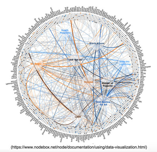
The human mind can only process a limited amount information at the same time. When a person presents a chart that has 100 elements, the audience may feel the information is hard to digest. The visualization below could be a powerful tool for power users. However, it will not be easy for most people to get what they need from it without instruction.
Day-to-Day Charts
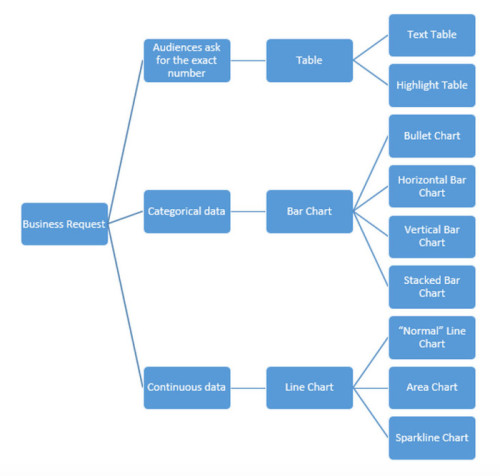
What are the most commonly used chart types in your mind? Line charts, bar charta and tables may on the top of your list, and there are many variations of these three main charts. Below is a decision tree that is helpful when deciding which visualization to use.
Tables
Text Tables
Text tables are one of the most popular charts. Although it may not be the catchiest visualization, it comes in handy when the audience needs to focus on numbers. In the early stage of a reporting project, it is a good idea to include a text table under a catchy visualization. This can help to build up the audience’s confidence in the visualization. In order to build a reader-friendly text table, we need to:
- Align whole numbers to the right.
- Align decimal numbers on the decimal point.
- Make sure titles of each column are aligned with the content.
- Include a self-explanatory title.
- Limit grid lines, as they do not carry any information. With a small table, eyes can easily follow numbers across.
Highlight Tables
A highlight table is a good way to get your audience to focus on the most important numbers. In the table below, we can quickly see in the central region that the furniture category lost $3990 in consumer segment.
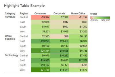
One thing we need to be careful of is making the table too “busy” with color. As I mentioned earlier, the human mind can only process a limited amount of information at the same time. I prefer to create a highlight table that uses color for the number I want my audience to focus on.
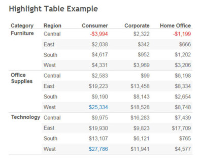
In this example, I created a highlight table with a different color-coding strategy. I only highlighted the top two biggest losses and top two biggest profits. Instead of highlighting the background, I made the numbers a different color. The table looks cleaner and is easier to read. Instead of using red and green, which is a common color blindness, I used red and blue.
Line Charts
Standard Line Chart
Line charts are a great way to present continuous data. It shows the trend and relationship between each category. Some things we need to keep in mind when we building a line chart:
- Carefully pick the range of the Y-axis. Using an awkward axis range may send out misleading information. I used the same dataset to build out the two line charts below. Each chart uses a different data range for the Y-axis. If we focus on these two orange lines, the one on the left has a steeper slope than the one on the right. A “rule of thumb” for picking the range of the Y-axis is the line should cover approximately two thirds of the chart’s space.
- Always use a solid line. Shapes (e.g. dots, dashes) in line charts don’t carry any information. On the contrary, it will increase the complexity of your line charts. Use solid lines in different colors to differentiate each line in a chart.
- Use less than six lines in a single chart. Limiting the number of lines allows our brains to better catch useful information.

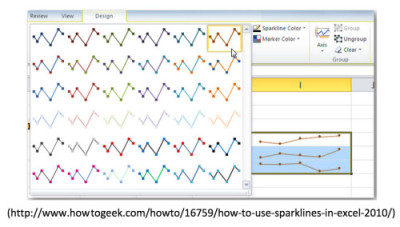
Sparkline Charts
Sparklines are a series of line charts without axis, colors and grid lines. The beauty of Sparklines is that users can easily catch the trend and variance of many different entities. It is a good practice to place a table right next to the sparkline chart.

Area Charts
Area charts are special line charts that provide the total number and percentage of each category. If we want to present the same information below in a pie chart, it will require three different pie charts to represent 2011, 2012 and 2013. With an area chart, I can integrated all this information into one visualization.

Bar Charts
Vertical Bar Chart & Horizontal Bar Chart
Bar charts are an excellent solution for categorical data, and vertical bar charts are one of the most commonly used chart types. These charts show the relationship between each category.
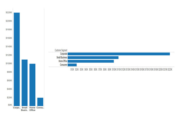
Two major reasons to use horizontal bar charts include:
- Ranking from the largest to smallest. See the example below. Our brains are trained to catch the larger number. By sorting this horizontal bar chart, we can easily see corporate segments bring in the most profit.
- Shortening names. From the vertical bar chart below we can see Tableau didn’t spell full names for each category due to some names being too long. Without sacrificing precious real estate on a dashboard, horizontal bar charts spell out names without a stretch.
Stacked Bars
Like area charts I showed earlier, stacked bar charts are a good countermeasure for pie charts. If you see the customer segment in the west region on the stacked bar chart below, you can see it has a negative number. We can plot negative numbers on a stacked bar chart but not on a pie chart.

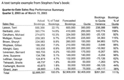
Bullet Charts
Stephen Few* introduced the bullet chart in early 2000, which is a good way to check progress. Here is an example from Few’s website.

Building a visualization is more an art than a science. There is no “best practice” in data visualization. After reading this article, you will have a good framework for how to pick a starting point and where to go from there.
Note – Tableau Superstore Sample Data was used to build image visualizations.
* Steven Few is an expert in data visualization area. According to Amazon: “Stephen Few is the founder of the consultancy Perceptual Edge. He speaks, teaches, and consults around the world and writes the quarterly Visual Business Intelligence Newsletter. He is the author of Information Dashboard Design: Displaying Data for At-a-Glance Monitoring and Now You See It: Simple Visualization Techniques for Quantitative Analysis.”
I used the “text table” and “bullet chart” from his book, Show Me the Numbers: Designing Tables and Graphs to Enlighten.